Remove the cockpit.
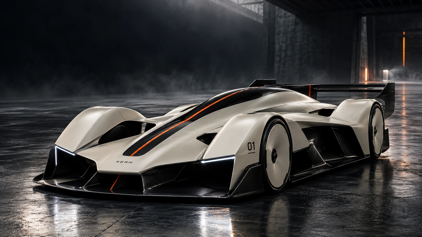
Without a driver on board, the silhouette can be reimagined around airflow, energy and computation.
A branding case by SAMUR-AI
Designing a new instinct.
STRATEGY. IDENTITY. EXPRESSION.
INDEPENDENT BRAND CREATION
The challenge
Racing has always been a story of human instinct. An autonomous electric car changes the protagonist. For this self-initiated project, we asked what a new performance brand could stand for when its defining quality is its ability to learn.
Our response was a complete brand world: a compact name, a custom wordmark, a directional graphic system and a distinctive editorial voice. The car sets the design brief. The identity gives that ambition a form people can recognise, across every encounter with the brand.
01 / The product behind the brand
The R.01 is an autonomous electric track-car concept. AI-assisted design exploration and an imagined autonomous control system provide the foundation for the brand story.
Without a driver on board, the silhouette can be reimagined around airflow, energy and computation.
A central spine and a single orange line give an invisible system a recognisable physical expression.
The ambition is a record programme: learning demanding circuits, with every attempt generating the next question.
Form informs identity
The contrast between smooth surfaces and exposed structure became a design principle for the brand. Broad, calm fields meet precise cuts. A restrained palette is interrupted by one unmistakable signal.
Exploratory product targets, not measured performance. The project defines a design vision rather than a validated engineering package.
02 / Naming & brand platform
KERN evokes the core: of energy, computation and decision-making. Four letters with a compact, solid presence. A name that feels at home on a machine and in a laboratory.

An autonomous performance brand built on the pursuit of measurable progress.
Precise in its expression.
Restless in its ambition.
Learn the limit.
Then move it.
03 / Designing the identity
We built the wordmark from a shared set of decisions: a strong horizontal stance, consistent stroke weight and directional cuts. The K becomes a compact symbol for the same movement.

The complete name carries the launch. The K works where space is limited: a component, an access pass, a digital icon. Both use the same geometry, so the system remains connected at every scale.
The stem defines a unit. A 23-unit stroke gives the K its weight within a 100-unit cap height.
xOne stem-width of clear space protects the signature. The mark keeps its own field, even inside dense layouts.
The name introduces the brand. The symbol becomes a shorthand on small formats and repeated encounters.
04 / The visual system
Carbon and ceramic establish the material world. Titanium provides a technical neutral. Signal orange identifies the moments that matter: a line, a decision, a direction.
Learn the limit.
Then move it.
A direct grotesque gives the brand its public voice. Monospaced type gives specifications and labels a measured rhythm. Expressive scale is balanced by clear hierarchy and generous space.
The tone follows the same discipline: short statements, specific ideas and ambition tied to evidence. “Learn the limit. Then move it.” makes the brand’s purpose easy to understand.
05 / A graphic language, not just a logo
We extended the energy of the K into a composition device. Its diagonal becomes a cut, its repetition becomes a rhythm, and its scale gives the identity a physical presence.
The symbol stays intact.
The surrounding field moves forward.
An oversized fragment turns the K into architecture. Recognition comes from the geometry, even before the full name appears.
Offset contours suggest iteration and continuous learning. Repetition belongs to the graphic field; the master logo remains singular.
Orange marks a change of direction or a point of attention. The surrounding neutrals give that signal room to work.
06 / Composition & typographic voice
A simple editorial hierarchy connects the expressive and technical sides of KERN. Large statements lead; a stable grid organises the evidence beneath them.
Nimbus Sans Bold. Tight spacing, short statements and a deliberate edge to the frame.
Nimbus Sans Regular. Quiet, direct language with enough space to make the idea clear.
Nimbus Mono PS. Identifiers, serials and captions aligned with the same precision as the machine.
07 / Art direction & brand narrative
We chose architectural light, tactile materials and believable racing environments. The images move from a quiet studio reveal to the tension of a circuit, giving the same machine two emotional registers.
The proposed record programme gives the brand an ongoing story. Each destination represents a different challenge for the machine and a distinct narrative for the audience.
Read the terrain.
Hold the load.
Find the rhythm.
Manage the energy.
Proposed narrative destinations. No circuit affiliation or record attempt is claimed.
08 / A recognisable campaign system
Three layouts test the range of the identity. A typographic manifesto, a product-led launch and a graphic statement share one signature, one hierarchy and one point of view.
MANIFESTORECORD MACHINEFORWARD FIELDRecognition does not depend on placing the logo everywhere. Cropped geometry, a disciplined palette and the contrast between monumental type and precise labels make the family hold together.
The system is intentionally flexible: product imagery can become the focus at launch, while the graphic language carries the brand between appearances of the machine.
09 / Identity in the real world
An autonomous racing brand still belongs to people. We extended the identity to the engineering team: a crew jacket, equipment case, notebook, component packaging and access credentials.
The same hierarchy carries across every touchpoint: a confident name, restrained technical information and a small burst of orange. The brand is designed to belong in the workshop as naturally as on a launch image.
These application studies test the visual territory. The vector wordmark and monogram define the master identity for future production.
10 / From identity to experience
We translated the system into editorial, social and operational formats. Each object has a different purpose; the relationships between mark, type, colour and space stay consistent.
V.01 / 2026Every element has a role.
Every detail has a direction.
Every expression moves us forward.
KERN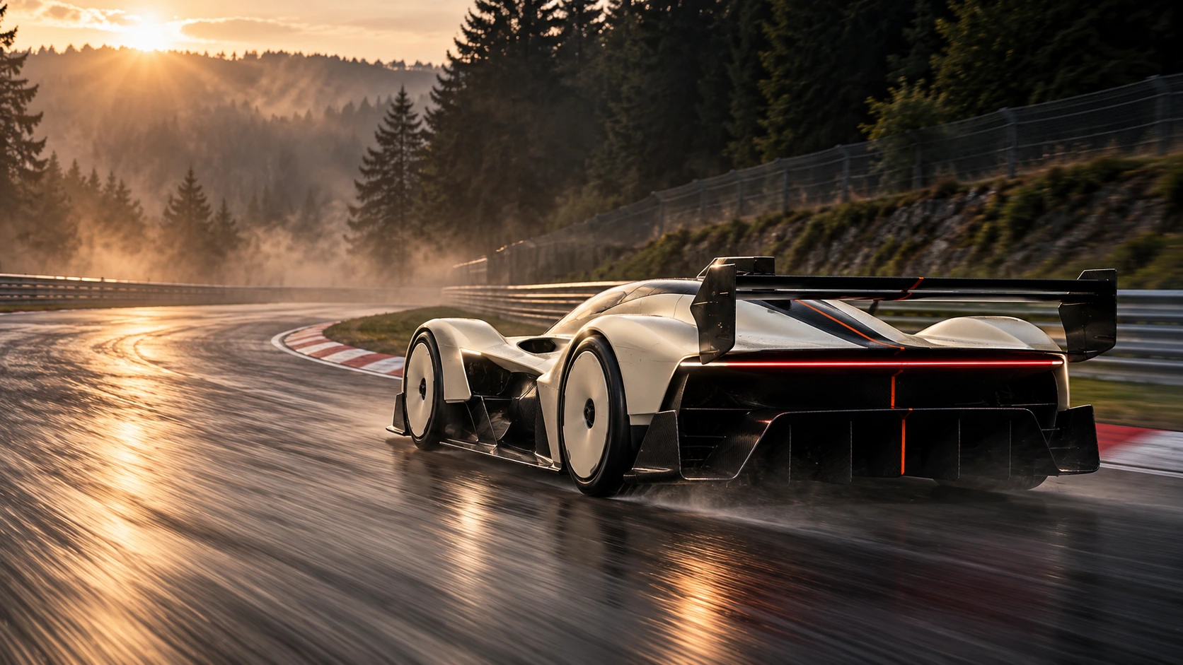 ENGINEERING
A working system.
Built to be used.
The campaign language.
Scaled to the feed.
Operational clarity.
A shared sense of belonging.
11 / The identity at a glance
The final system balances a fixed core with an expressive outer layer. The signature, palette and type define recognition. Cropping, scale and imagery let the brand respond to context.
01 / SIGNATURE02 / SYMBOLThe creative outcome
KERN demonstrates how a brand can be created around a product that does not yet exist. We connected the machine’s imagined purpose to a clear name, a recognisable design system and a visual world with its own point of view.
The result connects custom lettering, a flexible graphic language, campaign art direction and practical identity guidelines. From a launch poster to a workshop pass, every application carries the same direction.
Your next brand
Independent brand concept created by SAMUR-AI. KERN R.01 is a design study, not a manufactured vehicle. Technical figures are exploratory targets, with no engineering validation or records achieved. AI-generated imagery illustrates the creative direction and may contain detail variations. The name has not been cleared for commercial use.